
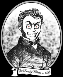
 Salutations, traveler of The Internets! Welcome to William's Bloody Hell, so named after our founder, Sir Bloody William.
He is seen in the likeness above in a rare, 19th century woodcut. This
image was rumoured to have been
commissioned after a bout of unpleasantness
in the White Chapel district of London. Do enjoy your stay and peruse our many, varied offerings, much of which cannot be found elsewhere!
Salutations, traveler of The Internets! Welcome to William's Bloody Hell, so named after our founder, Sir Bloody William.
He is seen in the likeness above in a rare, 19th century woodcut. This
image was rumoured to have been
commissioned after a bout of unpleasantness
in the White Chapel district of London. Do enjoy your stay and peruse our many, varied offerings, much of which cannot be found elsewhere!
![]()
![]()
![]()
![]()
Check it out, bitches! Over one year later and a fancy new layout! Because you've all been so good. Yep.
Foist of all, this sucker may LOOK similar to the last layout, but trust me, it's completely different. The "blood & fire" layout was all done in a table whereas this one is all done with shiny divs. Divs had been plaguing my very life ever since I learned about their existence because I just couldn't figure them out. The most I could ever do is get one single block to nest inside a bigger one. Not a hell of a lot a person can do with that. But finally, HTML Goodies had put up a tutorial which even stoopid me could understand. Freakin' HTML is a jerk. Unfortunately, being a newly trained Div Master, even then I could not get the navigation to target the content cell. Listen to me with the lingo all cool-ass-like. In other words, I had the divs set up how I wanted them to look (a box for the image banner up top, a box for the navigation buttons, a box for the content, a box for the footer, and one big box to house them in), but I could not get the navigation buttons to change the page in the content box. They kept on opening in new windows! Grrr! So, I wound up having to use an iFrame INSIDE the content cell in order for stuff to show up there. This is too bad because it was lookin' all slick as purely divs, but whatchoo gonna do?
Supposedly divs are better than tables. Something about how they load faster or are more browser compatible or sumsuch. I really couldn't say. They're just one hell of a bitch to code, I can tell you. There's math involved, dammit. Stupid addition and subtraction! Since this is my first div layout, I'm hoping you, my trusty visitors, can point out to me if anything looks all wonky in your browser and/or resolution (I do believe "wonky" is a technical term). As for me, it looks pretty darn good in my Internet Explorer and 1152x864 resolution.
What you are looking at here (hopefully) is two images, as far as the colour goes. There's the main image up top, and a div background image inside the main cell. The main image goes from yellow to orange, and the background one goes from orange to reddish (down by the footer). I'm so happy that I could get that to work out visually. I wanted something a little more interesting visually than just plain old solid border colours, and the gradient kind of ties the whole thing together, doesn't it? Yes, yes it does.
While I'm talking about the images, take a look at that sweet fiery font up there, would you? It is called CHAR and I downloaded it FOR FREE from Blambot (in their sound effects section). Cause, well, they're awesome like that. If you ever need cool fonts for lettering or logos, they're the place to go. Seriously, I can't mention them enough. That's regular old Bank Gothic in the sub header "version 8" part.
And sorry about how darn big that image is up there. I tried a few things, but it just looked best this way. Sorry about all the vertical scrolling you'll have to do.
The navigation is the same, but different. I pretty much just took the old buttons and changed the rollovers from blood spatter to flames. I imported them into Corel Photo Paint 11 and used the image sprayer tool. It has a sprayer which looks like near photo realistic flames which it generates in a random pattern. So basically it was trial and error until I got some flames that I liked how they looked. Of course, those flames just make my hand drawn ones look pretty cheap by comparison. Oh well.
And we're back with black-on-black background. I had a few people say "AAAAHH! MY EYES DEAR GOD MY EYES ARE BLEEDING!!" with the last layout, so I thought black on black would be less harsh on your corneas. Also, I really like how the black inside the divs and the main frame background black all come together. And everything is all lined up vertically, which is nice and sends me to my happy OCD place. Which kind of worked out better for me than all of the tables I had done before. I finally worked out the difference between "padding" and "margins" and so on.
Yes, yes, it's STILL the black-red-darker red colour scheme. Boo freakin' hoo, alright? Once again, no external style sheets and hundreds (yes, as in plural) of pages that would need to be changed. No thanks. Too lazy for that. I think I could actually do them now though as opposed to my last layout change. I had to do some things for another website I work on, and managed to pull it off there. So nyeh. The red still matches with the fire and all.
That's pretty much the deal with all of this stuff. Any questions or comments feel free to fire away in the comment dealie below. Again, any viewing issues, please let me know. Suggestions are also welcome!
William (finally tamed the elusive and feral div)
comments powered by Disqus