
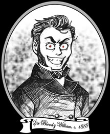
 Salutations, traveler of The Internets! Welcome to William's Bloody Hell, so named after our founder, Sir Bloody William.
He is seen in the likeness above in a rare, 19th century woodcut. This
image was rumoured to have been
commissioned after a bout of unpleasantness
in the White Chapel district of London. Do enjoy your stay and peruse our many, varied offerings, much of which cannot be found elsewhere!
Salutations, traveler of The Internets! Welcome to William's Bloody Hell, so named after our founder, Sir Bloody William.
He is seen in the likeness above in a rare, 19th century woodcut. This
image was rumoured to have been
commissioned after a bout of unpleasantness
in the White Chapel district of London. Do enjoy your stay and peruse our many, varied offerings, much of which cannot be found elsewhere!
![]()
![]()
![]()
![]()
:: Today's soundtrack: David Bowie "Scary Monsters" ::
Well, here we are. The new and improved William's Bloody Hell. Exciting stuff, huh?
A few words about this new layout: I new it was going to be black. I love black. I tried something different on the last layout, One Winter, but well I liked that for about a week and then in started to bug me. It was too white. So, I knew I was going back to black, and that I'd have an illustration of me by me on the left as usual. So I imported the illustration into Corel Draw 8 (where I make my layouts... ancient I know), and I 'm trying a few things with the image and a big black rectangle to make them work together. Eventually, I put the image behind the black rectangle, and was working with making the rectangle transparent. Eventually when I tried the circular transparency pattern I thought it looked neat. It reminded me of really old silent movies like Nosferatu. Then I thought of Nina's main page and I guess it sort of inspired me. I started to think that I didn't need color in the layout as long as I did a good job utilizing grey scale. So I made the first letter of each word in the title bar 20% black and rest 40% black. I was happy. I made the Content iFrame border 40% black and was happier.
I'm also using a great deal of "transparencies" in this layout. The background isn't 100% black, so I made all of the iFrames transparent to match. Also, the scrollbars and forms have transparent parts in them so the blend. If your browser doesn't support any of these transparencies, I apologize for all that red you are seeing. Red is the color I made transparent in the scrollbars and form blanks, so that's why that is there.
The font used to make the title bar and the sub-iFrame titles, is called Vivaldi. I stumbled upon it while making some of the lovely buttons in the "Linky!" frame. Yes, I'm STILL using CasablancaAntique font for the content. I really really like it. And I think it looks terrific with this new layout.
And about those buttons... I made a great deal of them myself because the sites I wanted to link there didn't have buttons. So that's why some of then look like crap. And now you're asking, "why do you still have the Link section in the main navigation if you have this Linky box?" I'll tell you. I was GOING to eliminate the Link page, but when I had to make so many buttons... I just couldn't take it. I was bleeding out my ears. I only got part way down my list of links and I realized that none of the online stores I want to plug will have buttons either, and decided I was going to give the button making a rest. I also like the Link Page because that was you don't have to wait for the marquee to scroll around again; you can just look it up on the page. I will still add to both the Linky box and the Link page.
And that featured button, the site of the month. I decided a Site of the Month might be a good way to generate some traffic, not only for me, but also other people. I'll tell you right now, I'm not going to be all that picky about who I put in there, but I won't put you if your site flat out sucks. I'll also say right up front, that since it's new, I'm going to start out by plugging my friends. That's why Becca is the first site of the month. April through June will be the other sites I have listed under friends, then I'll put plugs there to sites I like in general if no one applies for it. You can apply for Site of the Month and check out the list of past ones under the SOTM section in the Misc. Index.
There will be more Art added soon. With redesigning this whole site and the move I haven't had time to do any scanning. I had originally intended back at Geocities to post some of my oldies but goodies that I had done back in high school in a Swipe File, but well I had to save memory. These are finished, inked and colored pics I had copied directly from comic books out of boredom and for fun. These were also colored by hand with PrismaColor pencils so you can marvel at how I color out of the lines. So look for that soon.
Who knows what other crazy stuff I might do in here? With all of this memory I could do an awful lot. Any ideas or suggestions or if you have anything at all you would like to post here (with a link to you of course), just e-mail, leave a comment in the box below, tag the Tagboard or leave a message in the Guestbook. (by the way... the About Me section and the Guestbook link are still here but hidden again, because it's fun. Prove how smart you are by funding it and leaving a message in the book.). Don't forget to let me know what you think of this new layout while you're at it.
William (needs a nap after all
this work)