
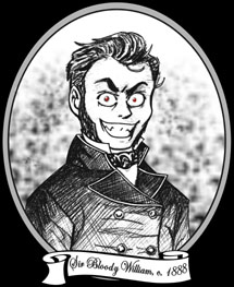
 Salutations, traveler of The Internets! Welcome to William's Bloody Hell, so named after our founder, Sir Bloody William.
He is seen in the likeness above in a rare, 19th century woodcut. This
image was rumoured to have been
commissioned after a bout of unpleasantness
in the White Chapel district of London. Do enjoy your stay and peruse our many, varied offerings, much of which cannot be found elsewhere!
Salutations, traveler of The Internets! Welcome to William's Bloody Hell, so named after our founder, Sir Bloody William.
He is seen in the likeness above in a rare, 19th century woodcut. This
image was rumoured to have been
commissioned after a bout of unpleasantness
in the White Chapel district of London. Do enjoy your stay and peruse our many, varied offerings, much of which cannot be found elsewhere!
![]()
![]()
![]()
![]()
:: Today's soundtrack: The Vince Guaraldi Trio "Linus and Lucy" ::
Yep, you guessed it; new layout means I'm going to talk about that for a while and nothing particularly interesting.
For starters, well I'm proud. This is my first entirely coded layout. Sorry, folks, but I'm a little slow on the uptake with all this HTML business. All previous layouts had borders and lines as part of the background image. THIS layout it's all in the HTML, baby! As a result, I'm hoping loading time on the main page will improve dramatically.
Before you ask, yes, this is one big, giant table. I started out trying to create tabled buttons that change color on mouse-over, and well, it just escalated from there. I'm one of those tidy, organization freaks, so a table actually suits me fine because I've got all these little cells to hold my stuff. I like everything to be in it's place and to have neat little boxes for them like this is just what I need. I was shooting for something like this with layout 3 Silent Horror, but wound up with all kinds of iFrames and nasty div layers instead. Tables were beyond me then. They still give me a migraine now. So, I'd like to thank Lissa Explains for their wonderful tables tutorial section and Elizabeth at Melancholy-Aura tutorials for giving the idea to begin with (she has this lovely navigation table which gave me the idea... so thank you thank you thank you!).
Also, since I've gotten away from div layers, I was able to center this one. I think it looks way better centered than left justified. I had to have the past layouts left justified to accommodate the div layer positioning I was working with. No more divs should mean, too, that people with browsers other than Internet Explorer should get everything right where it should be. I have my fingers crossed on that, anyway. If this is not the case, please contact me and let me know what looks funky (especially YOU Mozilla users out there, as I know my site has been cruel to you in the past!).
The navigation is still the same, just prettier! Same sections, with the same stuff located in the same spots.
On to the graphic. I had the idea for some time to do an image featuring me sitting outside the psychiatric help booth from the Peanuts comic strips, I just never put it into action. I hand drew the image of me sitting and did the rest on computer, mostly in Corel Draw 11 and Adobe Photoshop 7. I utilized many of the concepts from a past layout image, Autumn Leaves. The same grass blade and maple leaf nibs were used. The tree branches I got from the Tim Burton short film Vincent title card (which I had just used on a CD cover), except duplicated and modified (added branches, recolored, etc) by me. Yes, that is an autumn picture, and here we are in the dead of winter, yeah, yeah. Who cares? Autumn is my favorite season, mmkay?
In addition to autumn being my favorite season, I had been wanting to do a dark red layout for a while now, and thought that red autumn leaves would be a good way to carry the layout colors into the graphic. Having the psychiatric booth be red just added to that bridge. You might be saying to yourself that you remembered the booth being yellow or something in the Peanuts strips. Truth is, I've seen it both red AND yellow. I was just never really a fan of yellow.
Oh, and in case you haven't gotten it and need it spelled out: this layout is titled, Version 5: Good Grief. The name "Good Grief" is also from Peanuts, you silly. It was a phrase often said by the lead character, Charlie Brown.
While I was adjusting the style sheets on my pages, I also fixed up the old Rants so that hopefully the all look uniform now. I was a little lazy the last layout change and didn't bother then. They should all now have bolded soundtracks with a red horizontal line following. I first started using horizontal lines in the last layout, Here Comes the Rain, so all rants dating before that did not have them. They should all look pretty now. If I missed one, please, again, let me know.
And yep, just as it says above under the new stuff, now that the layout has changed, the Find the Guestbook contest has started a new round! So, if you've found it before, you can play once again, and yes, there are Prizes! Good luck with that, you guys. I hope to be getting signatures from you soon. Heh heh heh.
Basically, I think my skills at this whole web stuff have improved with this layout. Hey, I'm still not boasting about my M4D Sl<1LLZ or anything, but I'm getting better, right? Please let me know what you all think. If there are things you think I can do to improve, please either e-mail me or leave a note in the commenty box below or participate in the Visitor Poll. Thanks very muchly.
William (does the Snoopy dance)