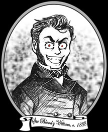
 Salutations, traveler of The Internets! Welcome to William's Bloody Hell, so named after our founder, Sir Bloody William.
He is seen in the likeness above in a rare, 19th century woodcut. This
image was rumoured to have been
commissioned after a bout of unpleasantness
in the White Chapel district of London. Do enjoy your stay and peruse our many, varied offerings, much of which cannot be found elsewhere!
:: Today's soundtrack: Eurythmics "Here Comes the Rain Again" ::
Yeah, I know, what did Hell freeze over or something? Eh, six months have gone by since the last new layout, so I figured I'd put up a new one. Also, I wanted to be able to address some of the problems with the old layout with this one.
First of all, you'll notice this layout is not in a pop-up. the pop-up was all well and good, but I realized that if somebody else used the same code to make them, well their layout would show up in MY pop-up (and vice-versa). How annoying is that? So. No more pop-up.
Also, I'm sure you're seeing that this layout is in a completely different direction from all of the previous ones. I'm not yet sure if this is a good thing or a bad one, but I thought I'd try it out. The old ones all had image at left, content at immediate right, with navigation above content. I decided to switch it up and put the pic at the right instead, and the content is in this box thingy, which I have mainly because I'm a "type A" person and like to have things neat and organized looking.
Addressing some of the problems with the last layout, I changed the font from CasablancaAntique to Arial. I realized that not everyone has CasablancaAntique, and if they didn't the whole thing looked real funky. So I'm using a font that I'm SURE everyone end their brother will have.
Based on the advice I got from the Reviews of This Site, I also added a code to the link scrolling bar so that the buttons are less intrusive. It was noted by one reviewer that they were pretty distracting, so I got a code from Goddess Glow and made them semi-transparent, so that they don't stick out so much. They come into sharp focus when you mouse-over them, though. Pretty neat, eh?
Another recommendation was to have a Welcome statement, no matter how brief, so visitors will get a quick idea about the site. I wanted to be sure to mention that this isn't really a personal site (it ain't no blog), that there is a lot of content and how often I update. If you guys can think of something else that should be said in there, please let me know!!
That's the Site of the Month button at the base of the layout, there, along with the hit and online users counter. I know the SOTM button isn't really marked as such, but a note drops down when you mouse-over it. Hey, room was tight!
And, yeah I know, it isn't all black!! What's up with that? Well, I drew the picture of me over there, and I knew I would be wearing black in it, so I thought black on black wouldn't do. So I went with the next best thing, dark blue. And the storm clouds? Well, when I drew the picture, I had in my head this vision of me with my own person cloud raining on me. I thought it would be cute.
So, hopefully everything looks OK in everybody's browsers. I tested it in 800x600 res. and everything still lines up fine, but please alert me to any problems right away! And also, please leave me feedback on this new layout! And don't leave it at "Lookin' Good" either! I want the good stuff, dammit! Well, thanks for your time and indulging me, here. I'll post a more fun Rant next week, I promise. (Extra squishy thanks to PixelFX for their tutorials!)
William (has now gone blind)
