
 Salutations, traveler of The Internets! Welcome to William's Bloody Hell, so named after our founder, Sir Bloody William.
He is seen in the likeness above in a rare, 19th century woodcut. This
image was rumoured to have been
commissioned after a bout of unpleasantness
in the White Chapel district of London. Do enjoy your stay and peruse our many, varied offerings, much of which cannot be found elsewhere!
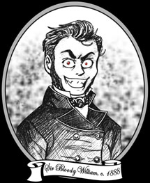
Salutations, traveler of The Internets! Welcome to William's Bloody Hell, so named after our founder, Sir Bloody William.
He is seen in the likeness above in a rare, 19th century woodcut. This
image was rumoured to have been
commissioned after a bout of unpleasantness
in the White Chapel district of London. Do enjoy your stay and peruse our many, varied offerings, much of which cannot be found elsewhere!
![]()
![]()
![]()
![]()
:: Today's soundtrack: The Pogues "London Calling (live)" ::
I bet that now this site had surpassed the 100 Rant mark you thought you'd be in for some sort of cathartic enlightenment. That now, you'd get those ever elusive answers to life the universe and everything... or something. No such luck, suckers.
As you can see, this site now has a new layout, Version 6: the zombies of death!! Sooooooo, guess what I'm going to talk about. Yep, that's right, I'm going to take a moment to go over this latest layout with you all. What? I only change it, like, what, twice a YEAR or something, so indulge me, yeah?
First off, title of the layout title is a line from The Clash song, "London Calling" which goes: "London calling upon the zombies of death, Quit holding out and draw another breath." So that's that, and what gave me the thought to go in a zombie-oriented direction to begin with. And finally, it's an image that gets the bloody in William's Bloody Hell down, right?
As for the picture, well, the basic look of it is what had been in my mind for some time, just the weapon kept on changing. So, finally I drew the pic, and I liked it, only I couldn't get any thing as far as weapon goes to look right. First a sword, then a bat, chair, a chainsaw would've been nice but I just couldn't draw one. Oh, well. Why a computer monitor? I'm sure you're all wondering, well a friend suggested to me when I mentioned my trouble that I go for an "odd blunt object", at first I was thinking like, what? an anvil??, but then specifically a computer monitor came out and I thought that would be good since 1) easy to draw and 2) I have all sorts of computer frustrations on nearly a daily basis. Also, my tee shirt in the picture is one I designed meself based on the name of a Cramps album, which is a line from the song "Bikini Girls With Machine Guns." The shirt does not actually exist, sorry. And I got on my ultra-cool-aren't-you-all-jealous trench coat. Oh yeah.
The original black and white line drawing of the image was done by hand by me with pencil and pen on paper which was scanned into Adobe Photoshop 7. I did some "computer magic" with the image in that the zombie on the far right in profile was waaaaay off on the right to start, so I used a mask and dragged it in more to center. Cool, eh? Also, all the coloring in whether it be black or red was done on computer. That includes all the texture in the hair and whatever. It didn't really start to come together until I used this spotty nib in Adobe to accentuate the blood splatters. That's some good blood, yeah? The zombies started to look more zombie-ish with blood on their mouths and stuff. Not exactly the most frightening zombies ever, I know, but I never did zombies before (seriously) so give me a break on that. I really like how the computer monitor looks with the blood on it and the crack down the middle being white and all.
Now the technical crap-o-la. I decided to stick with the whole table based design. I think it's working out well for me. I like the navigation buttons like that, I don't know why, but now even better since they're on the right hand side. I can't tell you how much better it is to have them there. I mean, you need to have the mouse on the right anyway to scroll up and down in the frame, so it was really, really silly to have to cross over to the other side to navigate and cross back to scroll and so on. Also, I was able to do with this design what I had TRIED to do with the last, is have minimal "main frame" scrolling. Meaning, I didn't want you to have to scroll the main layout up and down, just the content frame. That didn't work out too well on the last layout, but pretty good here. Oh and yeah, no more scrolling marquee on the main layout. Woo-hoo! I don't know why I didn't get rid of that thing sooner, to be honest. It looked good in version 3, but that's about it, really. So now the layout should load up much faster for everyone, since you don't have those evil buttons to load.
Oh, and yeah, I kept the same color scheme. What? You wanna fight about it? The thing is, I haven't mastered the external style sheet yet, so I would have to re-code the style sheets on EVERY SINGLE PAGE to change the colors. Your, normal, average, every day website, not much of a problem. But, I have well OVER ONE HUNDRED PAGES of... stuff and that takes a while to re-code, even if it is just copy/paste. It gets really borin'. (Re: I'm lazy as all get out)
Now, I've got a question for all the smart people out there about my table. I pretty much just moved stuff around on my old table. The old table looked fine, everything was evenly spaced, and whatever. THIS one however is ticking me off. Above the Home link at the top of the navigation buttons, the cellpadding or whatchacallit is WIDER there than everywhere else! If you can right click and check out my hideous coding and give me a hint how to fix it, it'd be much appreciated. I feel like I've tried it all to fix it, but I'm stumped. Currently I have border=1 cellspacing=0, and this is defined only ONCE in my main Table tag. I just like everything to be even and symmetrical and this thing is mocking me!
The Find the Guestbook game is still going on, but no one found it in the last layout. It's STILL there, and I encourage you to try and find it. Heh heh. You can claim a Prize for signing the guestbook and get a link if you have a website! Come on, it's fun!
I'd like to thank you all who come here, particularly those
of you who do so regularly. I like running a place that's a little fun and
doesn't take itself too seriously and maybe, on a good day, gets some people to
think about something sometimes. I know this place is a little messy and pretty
darn random and doesn't make much sense quite a lot of the time... where was I
going with this? Oh, yeah, but despite all of that you guys have still found the
entertainment value in some of this whether it be in responding to a goofy rant
or playing one of the contests. I salute you all! Hey! Maybe we ought to start a
secret society or something... hm. Food for thought...
William (finally put the bloody in bloody hell)