
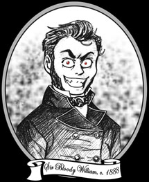
 Salutations, traveler of The Internets! Welcome to William's Bloody Hell, so named after our founder, Sir Bloody William.
He is seen in the likeness above in a rare, 19th century woodcut. This
image was rumoured to have been
commissioned after a bout of unpleasantness
in the White Chapel district of London. Do enjoy your stay and peruse our many, varied offerings, much of which cannot be found elsewhere!
Salutations, traveler of The Internets! Welcome to William's Bloody Hell, so named after our founder, Sir Bloody William.
He is seen in the likeness above in a rare, 19th century woodcut. This
image was rumoured to have been
commissioned after a bout of unpleasantness
in the White Chapel district of London. Do enjoy your stay and peruse our many, varied offerings, much of which cannot be found elsewhere!
![]()
![]()
![]()
![]()
::Today's soundtrack: Anka "Don't Weigh Me Down" ::
As an arty-farty type of person, I often design things. I design costumes for fictional characters, I design CD jackets for my mix discs, and I every so often redesign this website, to give some examples. I like it. I think it's fun and very satisfying when a design really comes together into a visually pleasing end result. One of the many aspects in the art of design, is the dreaded FONT.
I myself have quite a library of fonts at my disposal, and these days it isn't difficult for almost anyone to have a broad selection on their hard drives either, what with all of the free font websites out there as well as ones for sale at reasonable rates. However, even with the enormous plethora of fonts available to just about everyone everywhere, there are a few that I just seem to keep on seeing all over the place. I'm sure you're all aware of this little beauty:
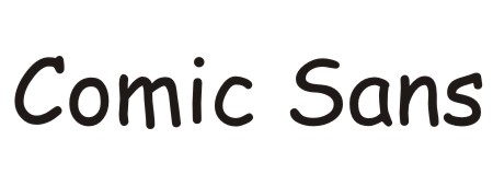
Yep, Comic Sans. We've all seen it everywhere. In fact, its use became so prevalent that it sparked the Ban Comic Sans movement. You can still see it on store signs all over the place, especially if the target demographic is children. Heck, I know of people who use it as their font of choice for e-mails!
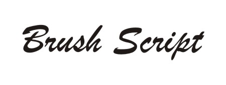
Brush Script is actually the very first font that I had noticed being used frequently. I had taken a few high school design classes, and these included font books. After I had seen this font in the book, I started to see it everywhere. Just yesterday actually, I had seen it used by three different business in my area. This is almost always the font of choice for when a business wants a little tagline under the business name. Some thing like: The Italian Cafe ... where friends come to meet! would have the "where friends..." part written in Brush Script typically underneath a bolded sans serif font business logo. Trust me: start scrutinizing the commercial breaks while watching television, and I don't care where you are, you'll see this at least once.
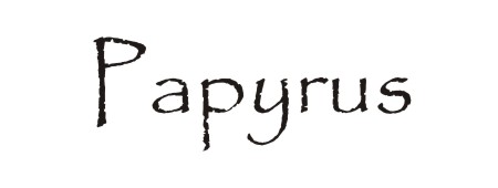
Papyrus has quickly become one of the "latest" go-to fonts, particularly if you have something "natural" you want to represent. Places like organic produce shops, or all-natural apothecaries will use a font like this, as well as Native American pow-wow vendors. Another use for Papyrus would be if you want an "old world" looking font. You may have also noticed the use of Papyrus as the logo for the films Serenity and Avatar, but then I don't find it the least bit surprising that one of the least original movies I have seen lately (Avatar) uses a stock font as its logo.
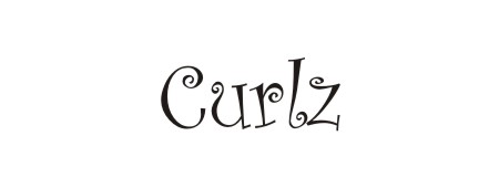
I have noticed Curlz popping up all over the damn place lately. There are at least two local businesses where I live who use it on their signage... and they're on the same street (Main Street)!! I can see the appeal of Curlz: it has a whimsy about it, but maintains legibility, and it's cute without being TOO girly (one of the local businesses that uses it is a Tex Mex restaurant). It really is a fun font and I can easily see this one taking off massively (if it hasn't already and I'm out of the loop) as it would appeal well to hairstylists, tanning salons, and any number of children's toy packaging.
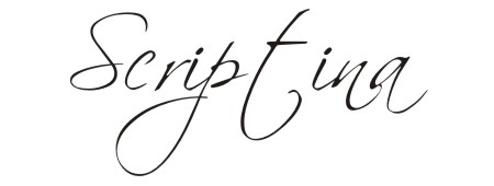
Scriptina is a font that I have mainly seen being overly used on the internet. With its sweeping, broad and graceful strokes, it is very easy to use on website graphics, avatars, signature images, blends, and so forth. It can set off any number of "moods" when used in different contexts from dark, gothic, poetic, retrospective, vintage, personal, and more. It is very lovely to look at, what with its varying line thickness mimicking human hand-written pressure points and such, but starting around three years ago or so, it had developed quite a ubiquity in website design that it is starting to smack of unoriginality whenever I see it.

I like Bank Gothic, I really do. You'll notice that I personally use it on my William's Bloody Hell Comic Strips. I like the square-ish look and all around letter size symmetry: none of the letters are taller than others or travel below the line. Despite my adoration, it is still used a lot, mainly during opening and closing credits of television programmes. Shows that are on a more "serious" tone will use some modified version of Bank Gothic such as 24. It is also widely used on business cards.
I am NOT a professional designer of anything; I only design stuff for myself or friends. Therefore, I have my own personal litmus test when looking over a design that uses fonts: if I know the name of the font you're using, then you're using the wrong font. While this doesn't mean 100% of the uses of the above mentioned or any fonts are bad ones, I find that it can hold true for many instances. Like I said: I am not a professional, so what I know of font names are from occasional, recreational review, so if I am THAT familiar with it, then it is used pretty commonly and therefore YOUR use of it will not "stand out" from all of the hundreds of others who have used it. That's what you would want as a professional designer, right? For your design to stand out from the crowd and grab a consumer's attention? Well, if you're using any of the fonts I mentioned here, you may want to rethink your design. Only sayin'.
William the Bloody (I like fonts)
PS- Yes, I am well aware of the Times New Roman I have rockin' the content text. Irony? Maybe. But I didn't use it in my main graphics at all. So nyeh.