
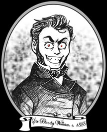
 Salutations, traveler of The Internets! Welcome to William's Bloody Hell, so named after our founder, Sir Bloody William.
He is seen in the likeness above in a rare, 19th century woodcut. This
image was rumoured to have been
commissioned after a bout of unpleasantness
in the White Chapel district of London. Do enjoy your stay and peruse our many, varied offerings, much of which cannot be found elsewhere!
Salutations, traveler of The Internets! Welcome to William's Bloody Hell, so named after our founder, Sir Bloody William.
He is seen in the likeness above in a rare, 19th century woodcut. This
image was rumoured to have been
commissioned after a bout of unpleasantness
in the White Chapel district of London. Do enjoy your stay and peruse our many, varied offerings, much of which cannot be found elsewhere!
![]()
![]()
![]()
![]()
::Today's soundtrack: Creature Feature "Gorey Demise" ::
What's all this, then? It's a massive layout design change is what it is! Why the incredible revamp, you ask? Well, we've got a couple of anniversaries of sorts to mark! First of all, this is Rant 250! I know, wasn't it 200 not that long ago? How the time does fly... and speaking of time flying, this marks FIVE YEARS that William's Bloody Hell has been live and in business! I was such a wee, ignorant, and innocent lad back in 2003 when I started this joint, sigh. Don't worry. I'm over that. Now I'm large, fairly knowledgeable and evil.
Alrighty. The first thing I want to mention as far as changes go is all that irritating HTML re-coding I had to do. One of the reasons I don't change things up too often around here is because I have quite a lot of pages and all of my style sheets are fucking INTERNAL. In case you don't know (because it wasn't so long ago that I didn't) a style sheet is the part of a website's HTML which sets certain "style" parameters such as colours, fonts, positioning, and so on. By having INTERNAL style sheets, in order to change any of these elements, I would have to open every single page and edit it. Now, I am happy to say, I have "upgraded" to EXTERNAL style sheets, which means if I want to change my style elements, I pretty much only have to alter ONE page. This will be pretty damn handy in the future. in other words, my HEAD went from this:
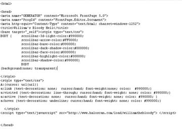
to this
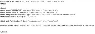
Pretty keen. So much more compact and purdy. Something maybe you'll notice if you wear glasses is that in my old style sheet, there was no font style specified in there. This means that every time I typed something in text, which font it would show up as was defined within the text and NOT in the style sheet. BIG mistake for me. So, another part of the recode, was going over every single page and removing ALL FONT TAGS. Luckily, I found a short cut. I used the "replace" function in Frontpage to seek out phrases like FONT FACE="ARIAL" and erase them. Do you know what I learned when I did that? Do you? Go on, test those brain powers of yours! After the search and replace function had finished running, it told me how many documents it scanned. Weeeeeellllll..... it seems I've got almost ONE THOUSAND PAGES!! Eeeeeee!! I suppose it makes sense, what with 250 Rants, hundreds of reviews, and all the art and such. It adds up. What I'm sayin' is, I had to copy/paste the new external style sheet into nearly 1,000 pages. All for you! My life for you!! ...ingrates.
Also, if you're in the know, you might notice something else glaringly omitted from my old coding. Yeah, that's right, there is no DOCTYPE specification! How is it possible this thing even showed up in your browser without one?? I have no idea, but I hear tell it makes quite a difference. I've already had some Firefox people tell me how certain pages are aligning better for them now. And by "better" I mean "how they were supposed all along but weren't because I was dumb and was missing crucial coding." Derp!
Blah, blah, HTML crap, blah blah. Anyway, onto the slightly more interesting visual layout stuff: the images! I had gotten the idea for an Edward Gorey Gashlycrumb Tinies theme a few months ago, but got stuck on the picture. I was thinking originally that I would be one of the unfortunate children who meets their untimely end. Only, well, "W" gets frozen in ice, and that's um, not very interesting. To me. From a drawing stand point. After turning it over in my mind for a while, I realized that I shouldn't be one of the kids, but instead DEATH! But wait, the Gashlycrumb Death figure has a skull for a head so how could you tell it's me? That's when I came up with the half skull/half face idea. I drew the shadows just so that they divide the face up nicely, I think. I put Grimm Spectre William walking amid tombstones because at the end of the Gashlycrumb rhyme, there is a drawing of a bunch of headstones, presumably for the dead children, so I thought that would work. Plus it got me out of drawing his feet. All of his lines were penciled by hand by me except for basic clean-up along the outer edges and to whiten the white areas, and adding a touch of black down in between the stones. The tombstones were also hand drawn by me, but filled in using the computer. To tie in the backdrop, I needed a texture so that it would look good with all the pencil strokes. So, the backdrop started out as a gradient, then some dust and scratch texture was added, along with some "photocopy" lines. Those lines really do the trick.
Now, I hope, hope, hope, fingers crossed that this content area looks okay for you. This is my first foray into varying frame opacity levels. It took me three tutorials to understand what the hell was going on and how it works, but I got it work, and in the end, isn't that all that matters? The answer is no. Basically, the content frame is really lime green in colour, but I turned that colour see-through, so hopefully, you do not see a gross shade of green any where. I needed a colour I knew I would not use because I was making that colour disappear, so it pretty much had to be an ugly one. Unfortunately, this means everything displayed within the content frame will have some degree of see-throughness, even this text, and even images! You'll likely want to open all images in new windows so you can look at them properly while I've got this semi-transparent content area dealie going on. Just a piece of advice there. [EDIT: I found out in the comments that Firefox peeps ARE NOT getting the semi-transparent effect! Waaah! So, I changed the transparent colour to a more pleasing grey tone so that your eyes won't scream so much. Hopefully, this won't adversely affect any of the artwork and such for the people who CAN see the effect! I'm working on this problem! If I don't kill myself first. /EDIT]
On the bright side, you can count on the navigation to not have changed. It's all right where it was before, only the buttons have changed. I'm using a "fake rollover" effect on them now so I think they should load and work faster than before, which I am told is a good thing. See, a "rollover" is when you switch between two different pictures. In the last layout, it switched from being black with red text to black with text and flames when you wave your mouse pointer over it. Now, it goes from grey words to red words when you mouse over it. I've got a Javascript in there which makes it look like a greyscale image until you mouse over and it turns to full colour, so it's actually only one image and not two swapping out, which is why it's suppose to work better. I hope this is indeed the case. (pretty please with sugar on top? please work correctly...)
I think that's everything for now. As always, please let me know if anything weird happens anywhere. If something is displaying funky or if a page is missing/doesn't work any more, whatever, I'd really like to know. In my re-coding adventures I had to redo and outright erase stuff, and before you know it, I'm still at it at four in the morning, sleep deprived and going crossed eyed from staring at HTML for hours upon hours, so who knows if I accidentally took out something crucial?? Could happen. In fact, it's pretty bloody likely. I found some stuff in there I had no idea what it was for. So I erased it and prayed it wasn't important. Who knows, I may once again snap the interwebs in half with this place!
So, while I put my wrist and hand in a brace to soothe it after thousands of copy/pastes, I would love to know what you think of this new design! Good idea? Bad idea? Hate it? Suggestions? Love to hear 'em! Thanks!
William the Bloody (wishes essence of murtlap were real)